The Scourge of ‘Win Probability’ in Sports
6 min read
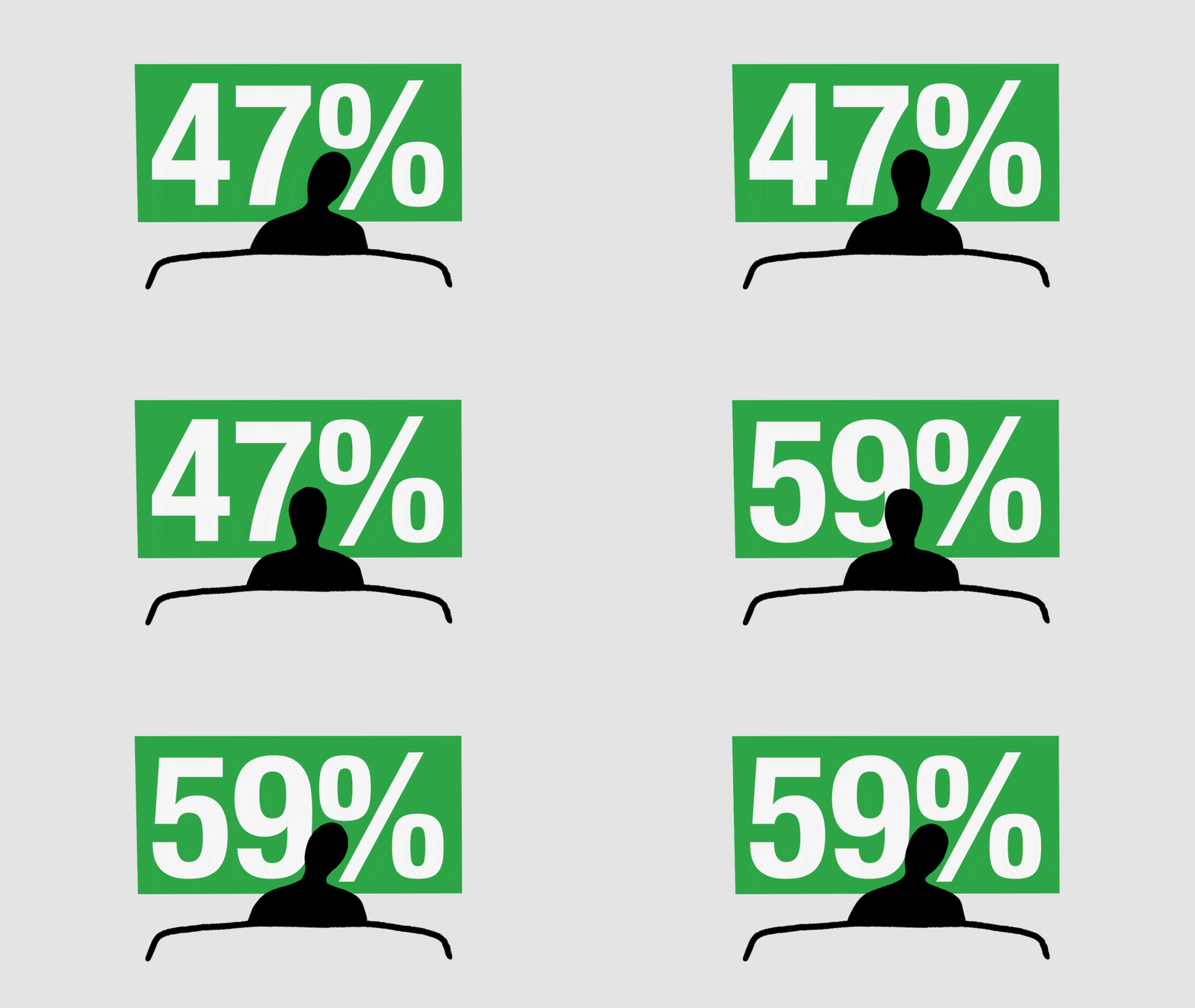
To watch baseball or any other sport is to confront the fundamental unpredictability of the universe, its utter refusal to bend to your wishes, no matter how fervent. In recent years, some broadcasters have sought to soothe this existential uncertainty with statistics. This season, ESPN announced that a special graphic would appear on all of its Major League Baseball telecasts. In the upper-left corner of the screen, just above the score, each team’s chance of winning the game is expressed as a percentage—a whole number, reassuring in its roundness, that is recalculated after every at-bat. Its predictions may help tame the wild and fearful id of your fandom, restricting your imagination of what might happen next to a narrow and respectable range.
You might think that so insistently reminding fans of their team’s “Win Probability” would be against ESPN’s interests. If your team is down by several runs in the eighth inning, your hopes will already be fading. But to see that sinking feeling represented on the screen, in a crisp and precise-sounding 4 percent, could make an early bedtime more enticing. The producers of reality shows such as The Amazing Race know this, which is why they use quick cuts and split screens to deceive fans into thinking that teams are closer than they really are, and that the outcome is less certain than it really is. But ESPN has a more evolved consumer in mind. We got a clue as to who this person might be in March, when Phil Orlins, a vice president of production at the company, previewed the graphic. Orlins said that Win Probability would speak “to the way people think about sports right now,” especially people “who have a wager on the game.”
Sports fandom has always had a quantitative component, but it has become much more pronounced in recent decades. As fans age, they tend to spend less of their time playing the games that they watch. They may have once mimicked a favorite player’s distinctive swing, or donned a glove and imagined themselves making a series-clinching catch. But having now left the playground behind, they don’t identify so naturally with players. They find it easier to cast themselves as coaches and general managers—numerate strategic thinkers surrounded by stacks of Excel printouts. Fantasy leagues were a gateway drug for people who liked their sports with a heavy dose of statistical analysis. Sports-gambling apps have become their heroin.
As sports gambling caught on, probability statistics started popping up everywhere in broadcasts. Apple TV+ has a whole dashboard that sometimes tells you how likely it is that each at-bat will end in a certain way. Similar graphics materialize whenever NFL coaches mull a two-point conversion. These metrics don’t appear to be very popular among casual viewers, though. Judging by enraged fan posts on X, people seem to find them either irritatingly redundant or irritatingly inaccurate. But the graphics have generated a new kind of postgame meme: When teams achieve an unlikely comeback victory, people who might have previously taken to social media to share a highlight of a late-inning home run may now share a simple plot that shows the exact moment when their team’s Win Probability swung from a low number to a high one. Last Saturday, Reed Garrett, a relief pitcher for the New York Mets, tipped his cap to this practice after the Mets’ eighth-inning rally against the Philadelphia Phillies. “Our win-probability charts are going viral right now,” he said.
Apart from this niche-use case, it’s not clear whether these statistics are even helpful for the people who watch games with the FanDuel app open. When I called up Michael Titelbaum, a philosopher at the University of Wisconsin-Madison who works on probability, he told me that these statistics are easy to misinterpret. “Decades of cognitive-science experiments tell us that people are really, really bad at making sense of probability percentages,” he said. Even doctors and other professionals who often deal in such numbers regularly make faulty judgments about them. Evidence shows that most gamblers have a hard time converting probability percentages into betting odds, and that they’re especially bad at reasoning about several such percentages in combination, when making parlay bets.
Still, whatever its downsides, the spread of probabilities through culture and entertainment may be having some positive effect on people’s statistical literacy. Kenny Easwaran, a philosopher at UC Irvine, compared it to the way the concept of temperature came to be appreciated by the public. In the mid-18th century, some scientists were skeptical that there would ever be a way to represent all the varied phenomena of hot and cold—a pan’s searing surface, a steamy jungle, the chill of a glacier—with a single number. But then the thermometer became pervasive, and, with practice, people learned to correlate its readings with certain experiences. A similar transition is now underway, he told me, as probability percentages have seeped into mass culture, in weather forecasts, medical prognoses, and election coverage.
But the win probabilities that ESPN puts on baseball broadcasts may not be much help, because they are generated by a secret proprietary model. ESPN’s formula is not a total black box. The company has suggested that it calculates the live, in-game probability from the same kinds of data streams that other such models use. These surely include the outcomes of many previous games that had identical scores, innings, and runners on base, but the company hasn’t shared what all is factored in. Is team strength taken into account? What about specific home-field advantages, such as stadiums with unusual dimensions, and extra-raucous crowds? Any fan can make their own ongoing judgments of the odds, based on all the games they’ve seen before and what they personally know about their team. They may have watched a player tweak his back in an earlier inning, or they may remember that a certain pinch hitter has had unusual success against the other team’s closer. Surely ESPN’s model isn’t operating at this level. But without knowing its specifics, one can’t really make sense of the percentage that it generates. It’s like looking at an election forecast the week after President Joe Biden’s disastrous debate without knowing whether it reflects fresh polling.
Plenty of viewers would prefer to rawdog games without predictive statistics. After all, anyone who is invested in a game will already be absorbed—to the point of madness, even—in the task of trying to intuit their team’s likelihood of victory. Easwaran told me that people are actually pretty good at this in the absence of numbers. He compared it to the organic way we use our reflexes. “If you throw a ball to me, I will probably catch it,” he said. “But if you tell me that it’s going to come at me at 15 miles per hour, at an angle of 60 degrees, from this particular direction, and ask me to calculate where I should place my hand, I am going to be really bad at that.” If you’re closely watching a baseball game, then you’ll have registered the score, the inning, and the number of people on base, and reflected them in your general level of anxiety. At best, the Win Probability graphic provides a crude quantification of what you’re already feeling. At worst, it gaslights you into second-guessing your sense of the game.
That’s not to say that sports broadcasts shouldn’t have win-probability calculators at all, only that the best ones tend to be humans who can explain their reasoning. Chick Hearn, the longtime play-by-play announcer for the Los Angeles Lakers, used to do a version of this in the closing minutes of every Lakers win. He would try to guess the moment when the team put away their opponents for good. “This game’s in the refrigerator,” Hearn would say, when he felt the game was out of reach, and then he would continue with a refrain that every Laker fan of a certain age can recite: “The door is closed, the lights are out, the eggs are cooling, the butter’s getting hard, and the Jell-O is jigglin’.” Over the years, his refrigerator call proved highly accurate. But occasionally, he was wrong, because no matter how good your internal model, teams sometimes come back against long odds. That’s why we watch the games.


